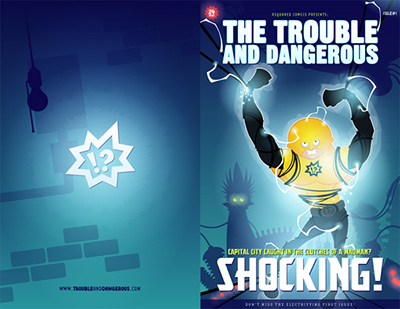
Issue 1 Cover:
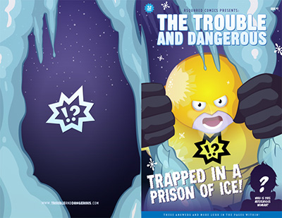
Issue 2 Cover:
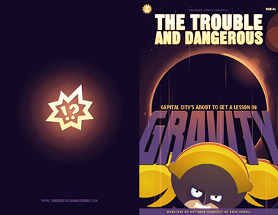
Issue 3 Cover:
Issues 1 & 2 have been printed as actual physical comics, issue 3 is getting pretty close with 16 pages complete. The Chapter 3 cover still needs some final polish, but it's coming together.
As always you can see all this for free at TroubleAndDangerous.com.
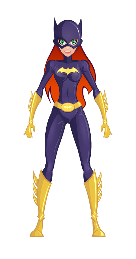
Here's a vector illustration I did of Batgirl just for fun. I'll probably try and do some more of these and maybe adjust the style a little. Overall I'm really pleased with how this turned out.
Not to much to say on this one, it's maybe a cover for chapter 1, maybe something else. This was all done in Illustrator except for the painterly overlay. Which was surprsingly easy.
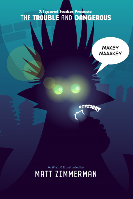
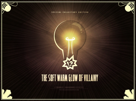
Chapter 1: The Soft Warm Glow of Villainy can be found at R Squared Comics.
The comic itself was made completely in Adobe Illustrator and is almost 100% vector art. The title page here features one of my most favoritest fonts ever Base by Emigre, specifically Base 12 (Sans & Serif). You can find some more art from the comic in various places around the site including older blog entries.
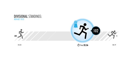
This is some concept art for a project I'm working on for the End Result Company. It basically needs to translate a runners stats into some sort of visual data.
This would consist of a background element and a foreground element that can move independently of each other. HTML text would fill in the specific values for that persons placement and the total number of participants in the race/division/anything.
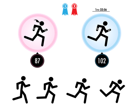
Here's another little tid-bit featuring the female art and some dudes running at various speeds. The original idea was to have a bunch of other figures running in the background but so far it hasn't turned out very well.
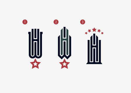
I'd been thinking about a way to do the a mark using the WH in some sort of structural way. Ultimately I came across the Modual from Emigre that had the right sorts of letter forms to make it all come together.
I played around a little bit with the idea of using shades of color to separate the various parts of the logo, but I think it works just fine as one color.
Here's the third header/logo design idea for the What a Hotel! website redesign. This one seems to be the favorite so far. There will be one more.
_matt

Design Blog:
It's generally considered bad practice or risky to include too many things in your official portfolio that ended up going unused by a client or were just created for fun. This section, in addition to my occasional random musings, is a record of such things. It might also include preliminary concept art or ideas that could eventually become a real portfolio piece.- View by Category
- Design
- Coding
- Flash
- Illustration
- Life, The Universe and Everything
- Music
- Movies
- Books

