Logo concepts for the MusicBurst music download service/website. MusicBurst was a web-based digital music download service similar that actually offered a pretty decent catalog. This was part of the World Wide Fan Clubs project, and allowed them to sell an artist's music through the fanclub site as well. 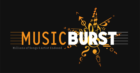
This one was my favorite, although the client didn't really go for the sheet music symbols to make the burst. I thought it turned out really cool, but I can see their point.
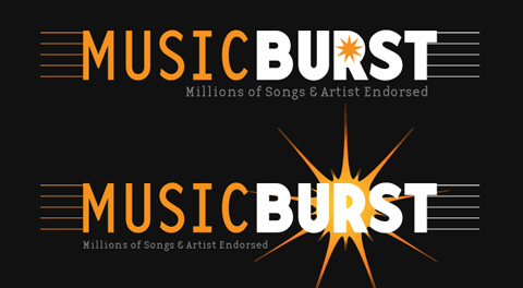
These have a generic style "burst" that were more like what they were looking for. I'm not sure any of these ever made it into the site, we weren't really working on the project directly.
These are both set in Emigre's Base Twelve Family (sans-serif) which happens to be one of my all time favorite typefaces.
